Canada Post
A look into my journey as a Product and Visual Design contractor
A look into my journey as a Product and Visual Design contractor
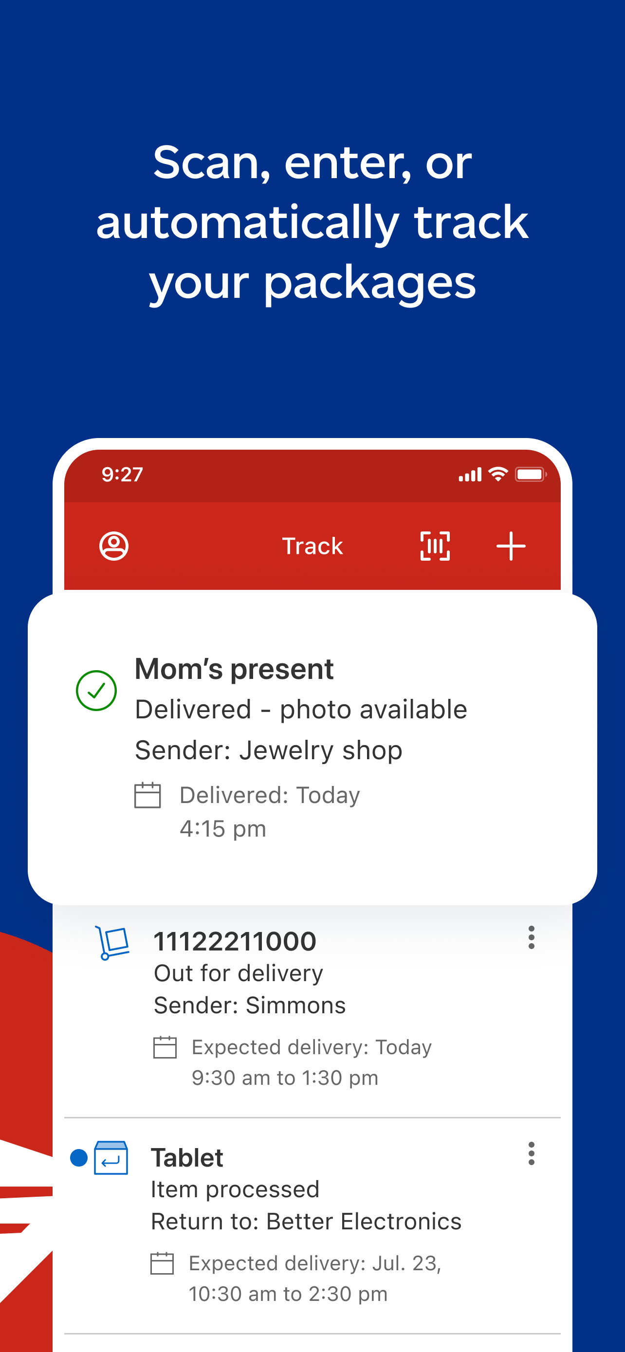
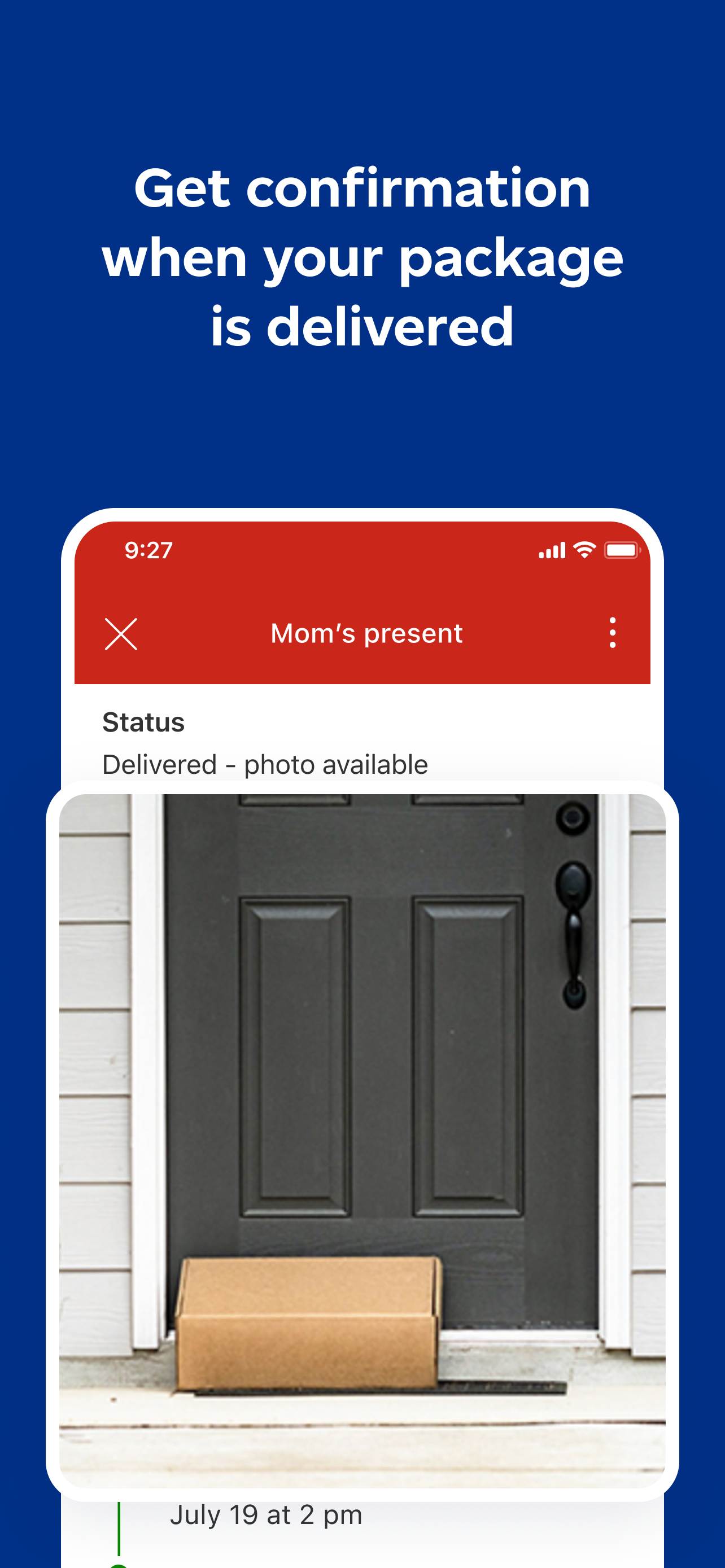
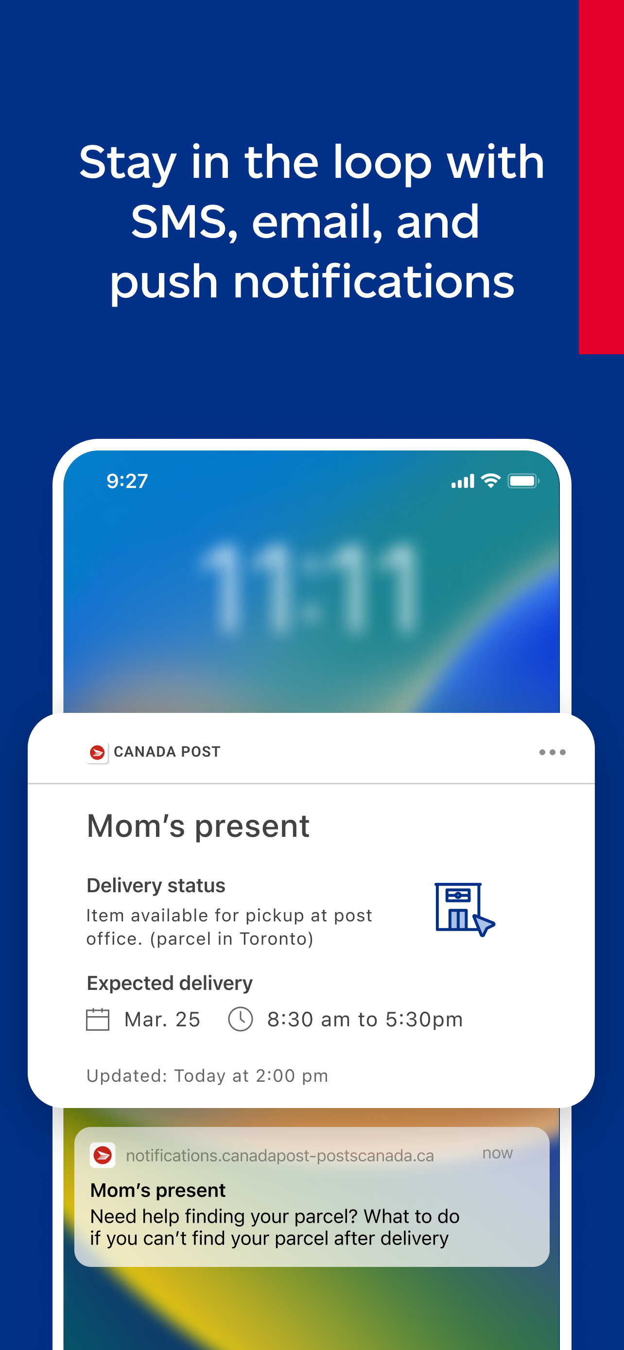
While at Canada Post, I actively engaged with the mobile team across diverse projects on both Android and iOS. Collaborating seamlessly with product, research, and accessibility units — alongside stakeholders — was pivotal in maintaining a unified user experience. Noteworthy contributions include designing the implementation of features like Dark Mode, Quick Drop, ushering in fresh visual design paradigms, and laying the groundwork for a comprehensive mobile illustration repository.
01 — The App
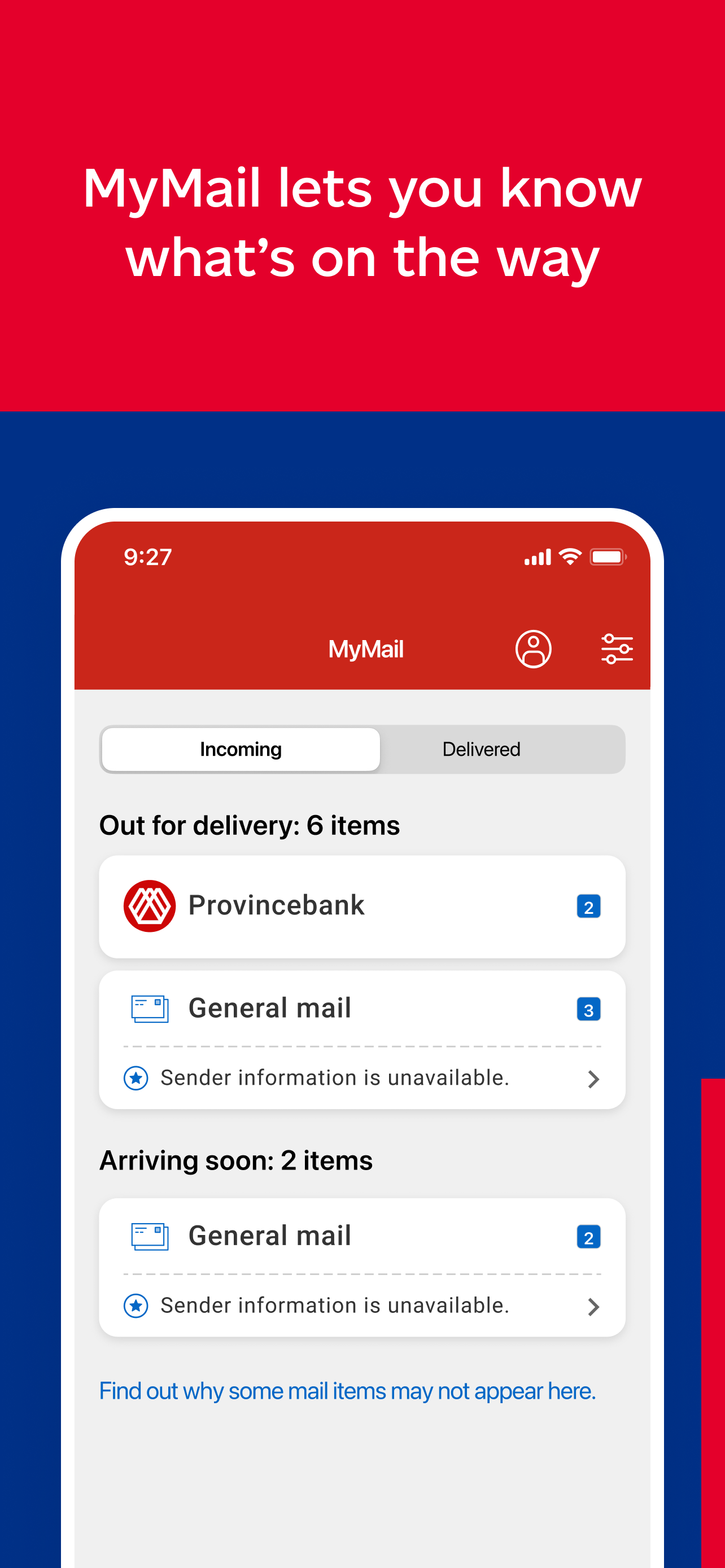
During my tenure at Canada Post, we maintained a steady app store rating of 4.6 stars. Throughout 2023, the app garnered 6 million net downloads and received a cumulative 32 million app updates.
In 2024 we saw a 10% increase in iOS users and 29% increase in Android users. More notably we also saw a 20% increase in registered users — approximately 46% of users are now signed-in users.
In my role as a product and visual designer, I contributed to approximately 20 releases, encompassing both enhancements and the introduction of new features — most notably the release of Dark Mode in February 2025.
02 — App Store
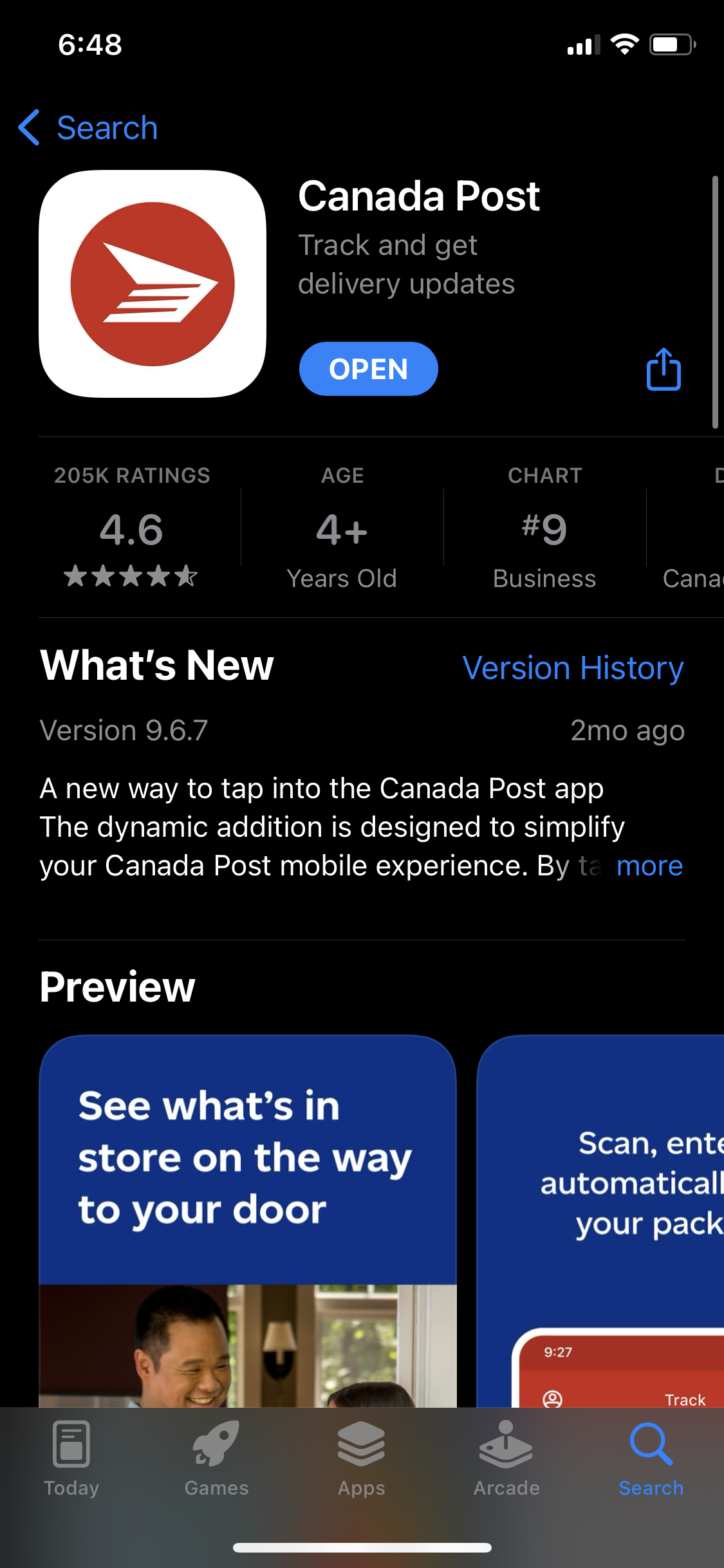
I partnered with a fellow designer and researcher to craft compelling App Store and Play Store images. These visuals not only defined our target user demographic but also effectively showcased the app's functionalities and features.


03 — Feature
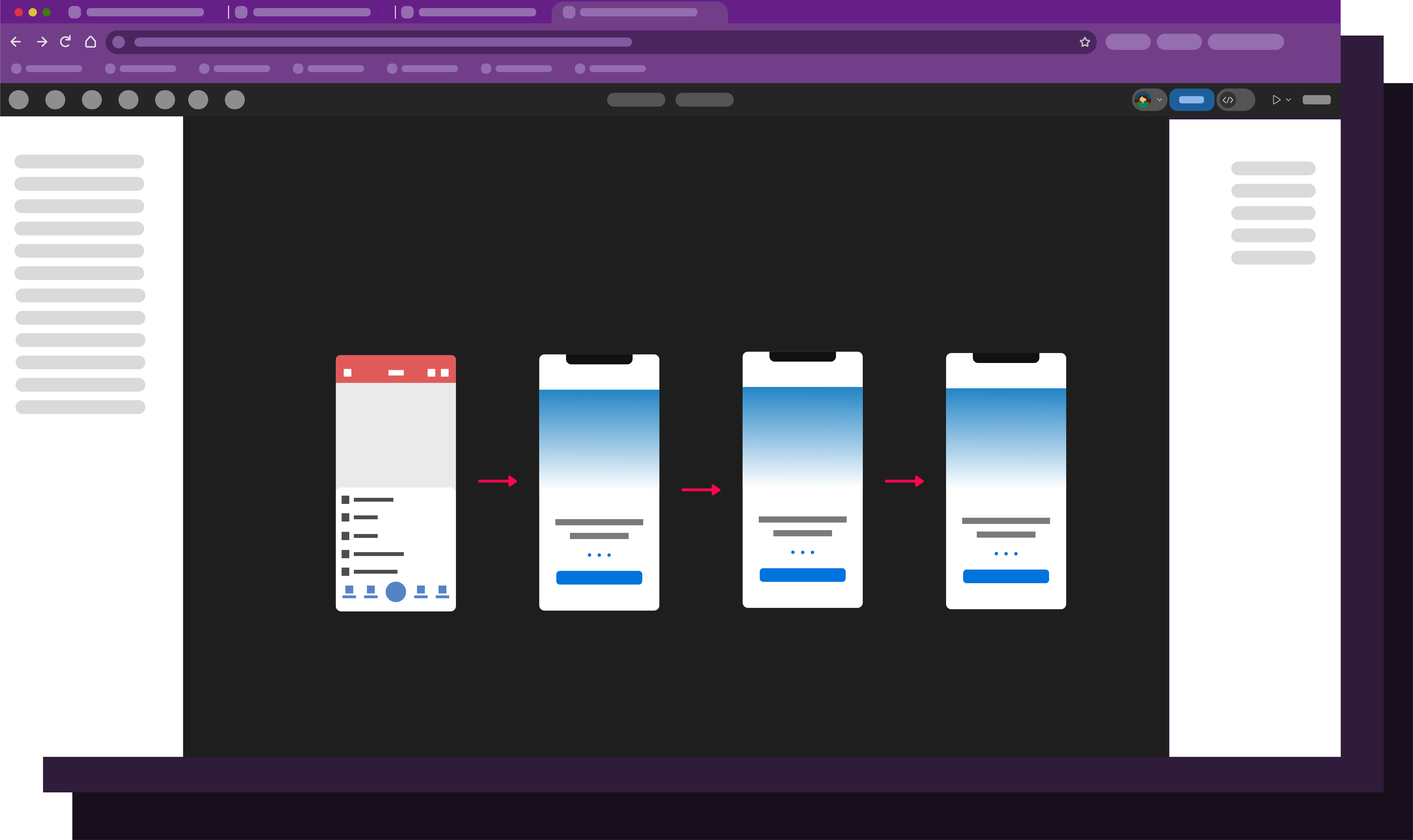
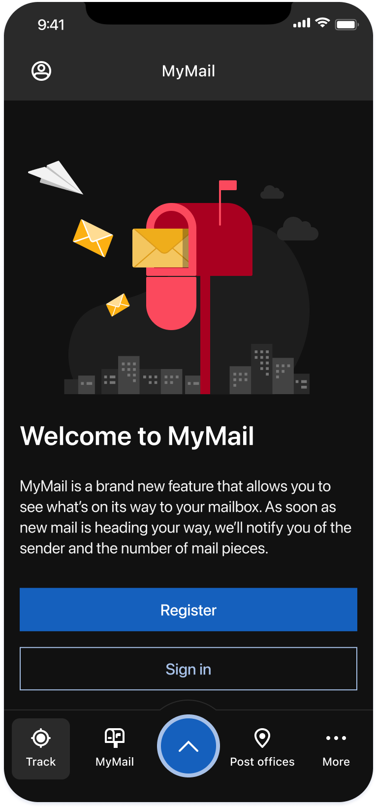
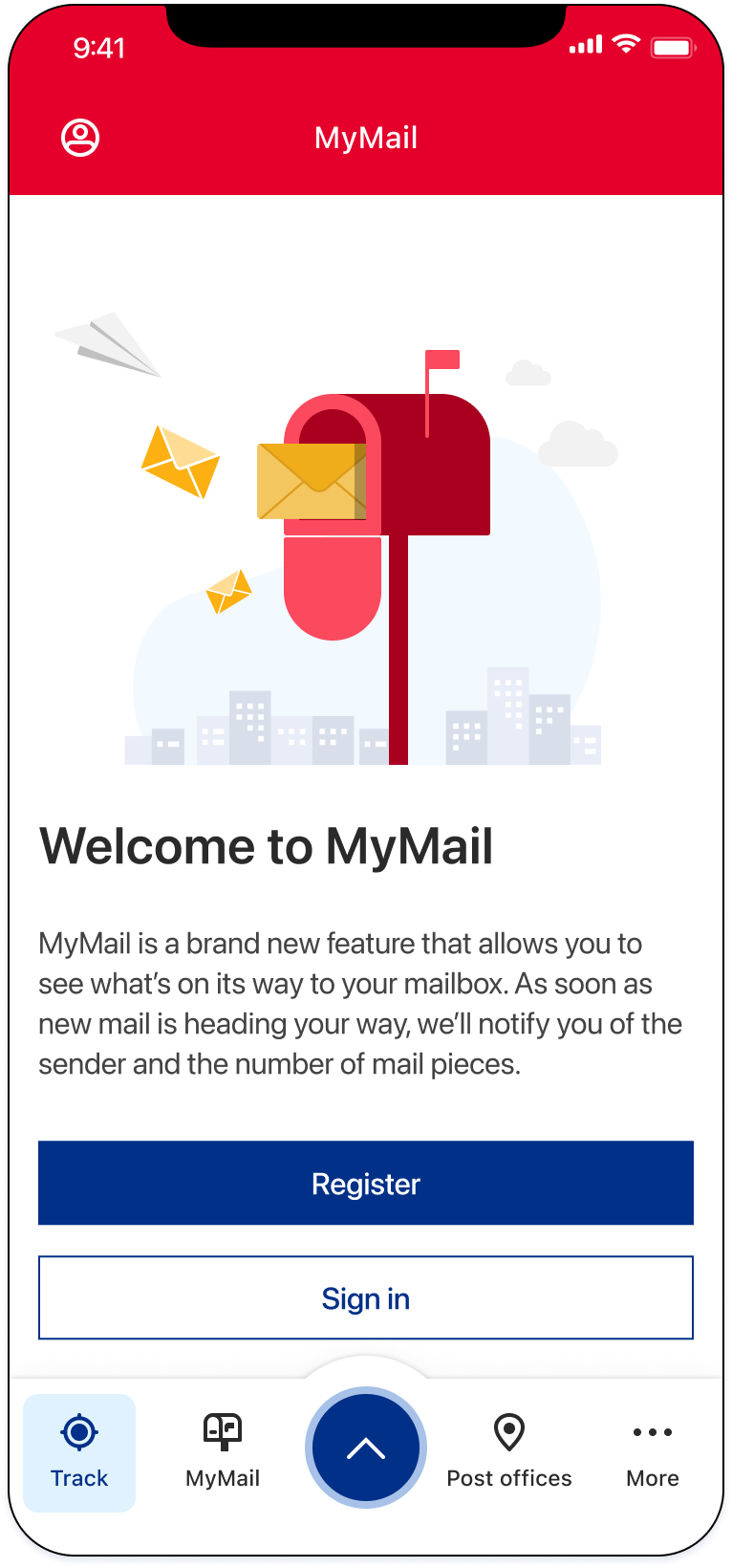
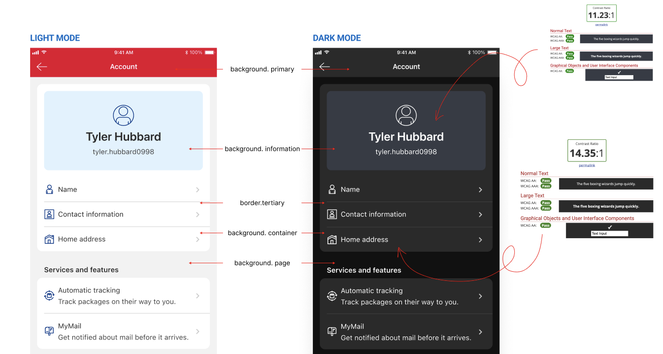
Dark mode is an increasingly popular display setting that alters the colour scheme of the user's interface to use darker colours. Studies have shown that dark mode improves readability and reduces eye fatigue in low-light conditions. Establishing Dark Mode, however, presented many challenges in both Android and iOS.
Easy implementation. Requires turning on a system toggle and replacing images and icons.
There is no systematic method to track illustrations and icons on the app — a consequence of technical debt accumulated over the years.
iOS and Android follow the M1 brand, an older design guideline, while the rest of the company uses M2.
M1 colours have to be mapped to M2 and then assigned a dark mode variant that is accessible.
Colours must be audited to remove duplicates.
Colours assigned for dark mode must be from the brand and meet accessibility guidelines.
Implementation must be future-proof — updates to the app should be planned to keep developer effort low.
During a comprehensive audit with developers, we discovered that the app had accrued significant technical debt including numerous duplicate assets and inefficient naming conventions. By compiling thorough documentation of these issues, we created a systematic and efficient approach to clean-up for the dev team.
In addition to auditing assets, we conducted a review of our colour library across both platforms — pinpointing duplicate, non-brand, improperly named, and hard-coded colours.
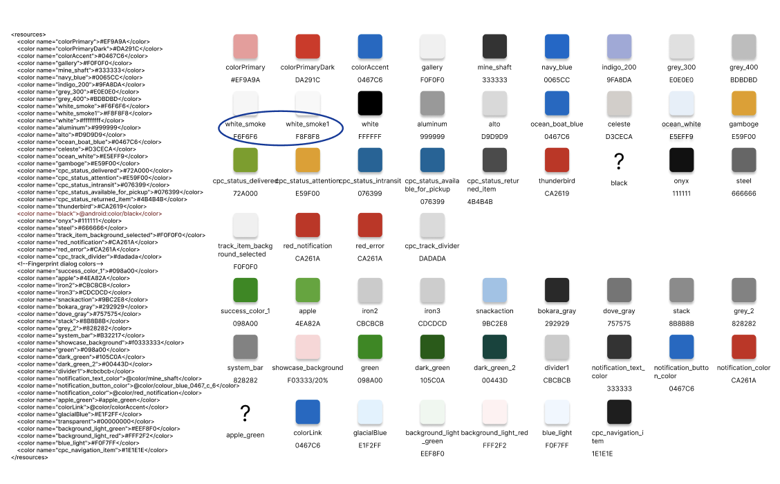
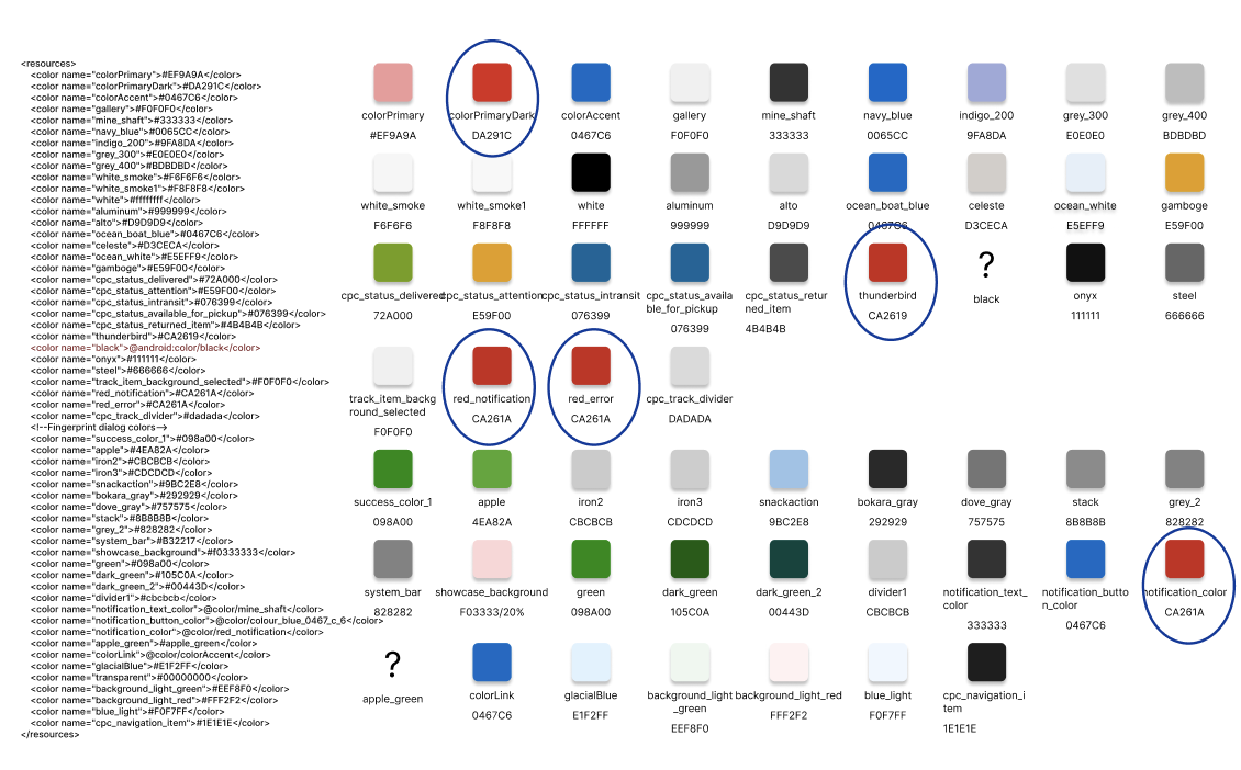
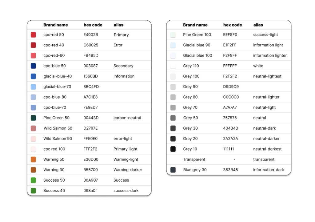
Through this audit, we consolidated duplicate and non-brand colours, organised them for both light and dark themes, and significantly reduced the colour library to about a quarter of its original size. Each hex code was given an alias referencing the brand colour, and themes were created assigning each colour to a light and a dark variant.
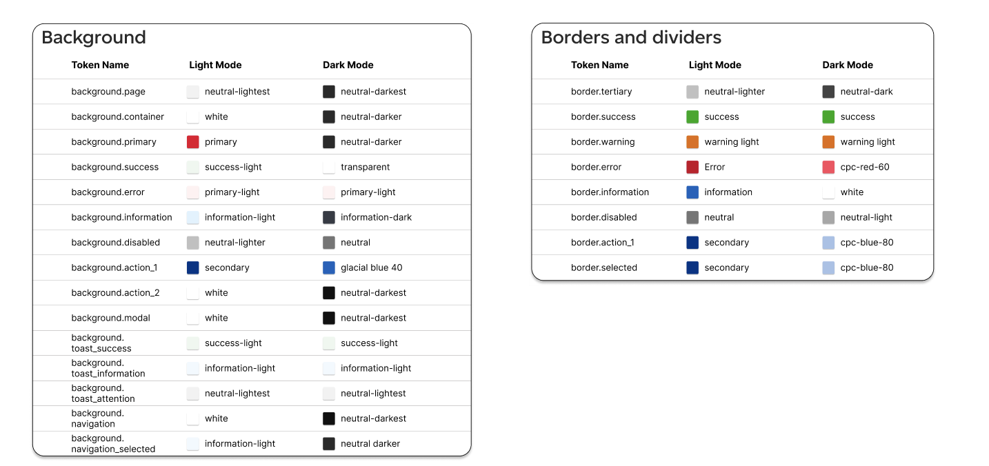
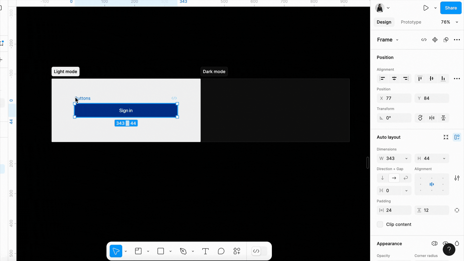
In parallel with the development execution, we crafted a comprehensive design strategy leveraging Figma theming and tokens. This cohesive framework enables designers to effortlessly translate work into both light and dark modes.
This project demonstrated its future-proofing by allowing developers to easily incorporate minor changes from stakeholders, thanks to meticulously tagged UI components. The introduction of Dark Mode not only enhanced aesthetic appeal but improved functionality — ultimately reducing development effort for future projects.
04 — Branding
I've played a key role in shaping the app's brand identity through visual design contributions. I led the transition to a fresh illustration style and curated an extensive illustration library distributed among various cross-functional teams. As the primary liaison, I facilitated adoption of this style and helped establish its guidelines.
View Slide Deck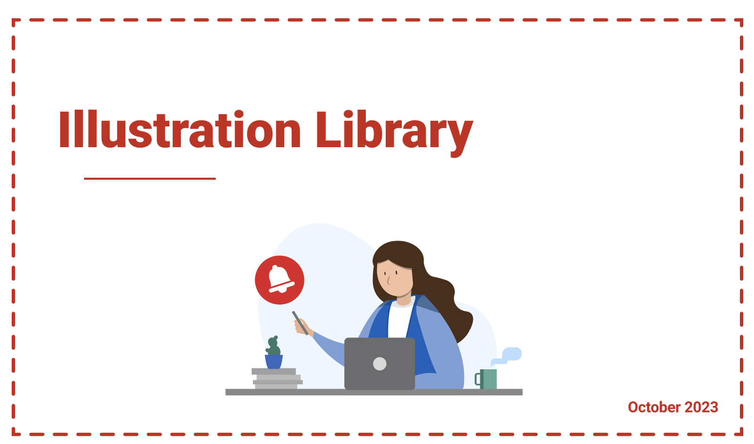
05 — Feature
Quick Drop is a streamlined shipping feature within the Canada Post app that allows users to initiate a package drop-off in a fraction of the usual steps. As the lead designer on this feature, I worked closely with product, development, and research teams to bring a seamless, accessible experience to both iOS and Android users.
Users were completing the standard shipping flow but abandoning partway through when simply trying to drop off pre-labelled packages. The existing flow required too many steps for what should be a simple action. We needed to design a shortcut that felt intuitive without introducing confusion to existing workflows.
Research revealed that the vast majority of Quick Drop users were returning customers familiar with the app. This allowed us to design an experience that assumed a certain level of context — surfacing key actions prominently while keeping the cognitive load minimal.
We conducted usability testing with participants across different age groups to ensure the feature remained accessible and met Canada Post's accessibility standards on both platforms.
The final design reduced the drop-off initiation flow to 3 key steps while maintaining full parity with the existing feature set. The feature launched across both iOS and Android in a phased rollout, with post-launch metrics showing a significant reduction in task abandonment within the shipping flow.
Quick Drop became one of the most frequently used entry points in the app for repeat shippers. The feature's success validated our hypothesis that simplifying high-frequency tasks leads directly to increased engagement and user satisfaction.